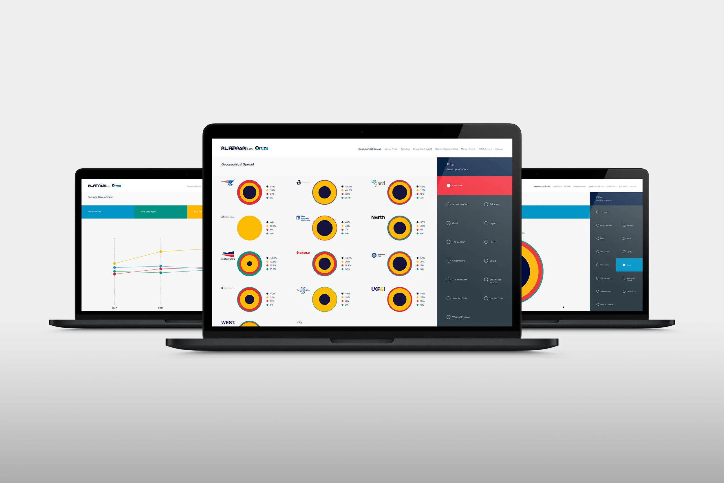
Refreshing a brand to encompass growth and ambition
Sector
Accounting / Financial services
Disciplines
Brand strategy / Identity / Imagery
Sector
Accounting / Financial services
Disciplines
Brand strategy / Identity / Imagery
The Result
- Refreshed messaging
- A new logotype, look and feel for the brand that is cleaner and easier to apply across all media.
The Competitive Edge
A refreshed global brand that tells its story more competitively, with clarity and conviction.
TMF Group offers the most comprehensive range of global accounting and compliance outsourcing services in its marketplace. With a globally expanding team and offices in over 70 locations they required a new burst of energy to their brand.
We were approached by TMF Group’s Chief Marketing Officer for guidance in refreshing the look and feel of the brand. In the past year the company had come a long way and they needed their brand to reflect this growth and ambition.
The first thing we embarked on was defining a core message that would underpin everything the TMF Group brand stands for. Working closely with key stakeholders, we arrived at Global reach Local knowledge.
The logomark was completely redrawn and guidelines written to ensure that brand consistency would be achieved in the global rollout.
The success of TMF Group is based on the knowledge and experience of their employees. To add authenticity real employees were photographed for using in all marketing campaigns. The imagery was shot with a fast lens to create a shallow depth of field, creating a short focus point around the subjects’ eyes. This increases the consumer’s connection with the subject, highlighting smaller details in their faces.
To bring this all together we created the ‘Allspark’ – a square graphic device that ties imagery to the brand and makes it unmistakably TMF Group.
The refreshed brand is cleaner and easier to apply across all media. With people at the centre of the brand, the human element is clear in the brand messaging.
8th September 2022
Shakespearian jokes aside, Škoda’s rebrand made me think about a piece we wrote back in 2020 following BMW and Volkswagen’s shift to 2D identities, you can read it here .
In addition to BMW and Volkswagen, we have seen several other automotives make the move from shiny analogue to digital friendly 2D identities; for example, General Motors, KIA, Nissan, Volvo. And why not? We live in an age where a logo has to work just as well on the front grille as on a screen.
However, a lot of what we said in 2020 is still true today - car makers can no longer rely on badges to differentiate themselves. If a large section of the industry is converging to 2D presenting a homogenised collection of brands, how do each of them create differentiation for themselves? What happens to the heritage and emotional ties that were woven into the original identities?
The brand message in this scenario has an even more important role to play. All supporting brand imagery and assets need to work harder, creating more engaging communications than the previous identity was able to allow. The resultant freedom for creativity in communications more effectively on, offline and in person will allow the brands to forge an even more intimate relationship with their audiences, especially those from the most discerning demographics in terms of content consumption.
Whilst it’s important to ensure the brand is effective in the digital world, one has to make sure that the result is not a bland identity that’s overly reliant on features such as animation to create personality. When that extraneous element is absent, things will be as useful as a two legged stool.
Maserati exemplified in its recent rebrand that it’s also important not to be so focused on the digital canvas, that everybody forgets it’s actually a physical product that’s being supported. Ultimately the product has to sell and has to be the hero, no matter how flexible the logo.
Have any questions? Send an email to: ajay@pangaeacreative.co.uk
Pangaea is an independent design consultancy that grew out of Formula1. We thrived in this cutting edge, fast-moving environment and now bring our experience of designing in F1 to clients and brands seeking to gain an edge over their competitors in any market.