18th March 2020
Are BMW's and Volkswagen's rebrands a sign of shift in the world of automotive brand design?
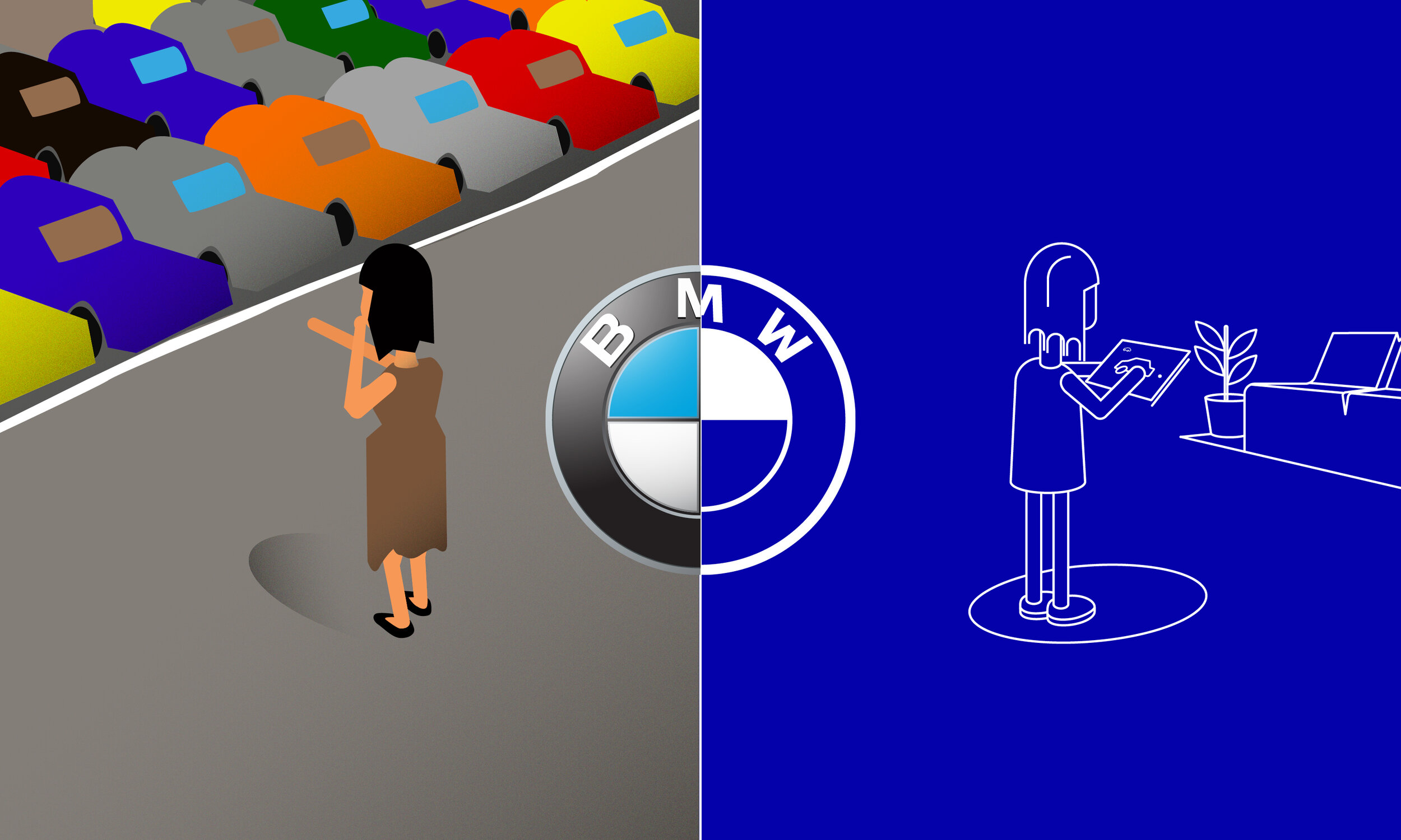
Illustration by Pangaea
Ask someone what their favourite brand is and you might get a blank look. But ask them what their favourite car brand is (and why) and they’ll tell you straight away.
That’s because car brands have an emotional pull like no other. Historically, the badge has played a big part in embodying that brand and engendering a sense of pride in owners. But as the recent redesign of two iconic logos shows, car makers can no longer rely on badges to differentiate themselves.
For us, this raises an interesting question: How can car brands keep their strong individual identities when recent trends see them drifting closer and closer together?
The future is digital-friendly 2D
We’ve been thinking about this since BMW and Volkswagen unveiled their new logos, the former just last week.
In both cases, the logo has gone from 3D to a flat 2D aesthetic to reflect a parallel shift taking place in the industry. Shiny, chrome 3D logos made sense in the analogue world, where they were a true representation of the badge you’d find on bonnets, dashboards and in showrooms. But today, that badge is an illuminated LED that also needs to be at home on electric and ultimately autonomous cars. And the logo that represents it has to work everywhere from websites and apps to social media and TV. It’s a crucial part of a customer experience that’s wider, and has far more touchpoints, than ever before.
In detail - Volkswagen’s new logo
Going 2D makes it difficult to reflect distinct brand personalities
BMW and Volkswagen aren’t the first carmakers to acknowledge this reality; Mini adopted a flat 2D badge in 2015. Nor are car brands the only ones making dramatic changes to reflect the digital world. Last year, Mastercard dropped the name from its logo because the future of payment is digital. And in January, Durex launched its new, “flattened” logo.
But for carmakers, the move to digital-friendly 2D presents a unique challenge. BMW and Volkswagen are very different brands, yet at a glance their logos now look the same.
It’s time to make the brand message do the work
So if all badges adopt the same aesthetic, how do the brands stand for different things in the hearts and minds of the consumer; how can car brands set themselves apart?
There are two points to make here. One is that even within the limits of a 2D design and logo shape, there are a lot of possible nuances. Take BMW for instance – "The transparent ring is meant to radiate "openness and clarity", explains Jens Thiemer, the company's senior vice president of Customer and Brand.
All supporting brand imagery and assets need to work harder and mean more; and this is no bad thing. This offers a new flexibility to create more engaging and dynamic communications that previous, more rigid CI's did not allow.
The second is that this minimalistic shift also brings opportunities. In this case, it’s the chance to create a strong emotional pull through a truly distinctive and differentiated brand message.
Fortunately for BMW and Volkswagen, they are both brands that come with a long heritage of communicating with emotion, particularly through marketing campaigns. The transition from 3D to 2D identity is something that the majority of established brands will have to grapple with as digital becomes fundamental to engaging audiences. The challenge for established brands is how they retain their emotional equity whilst remaining current through their design.
Have any questions? Drop us a line at hello@pangaeacreative.co.uk
Pangaea is an independent design consultancy that grew out of Formula1. We thrived in this cutting edge, fast-moving environment and now bring our experience of designing in F1 to clients and brands seeking to gain an edge over their competitors in any market.
